Posted by Maeve on Tuesday, Dec 15, 2015
Infographics, the graphic visual representations of information, data or knowledge intended to present information quickly and clearly, are the focus of a new book in the Iowa City Public Library's collection. The Best American Infographics is divided into four sections: the first, You, brings together pieces that about individuals, the second, US, groups infographics together about many. There are language maps showing the range of the most common to the least state-by-state and another about shows the distribution of letters in the English words.
The third, Material World, if chock full of marvelous displays of information. A particularly striking infographic is of the world's deadliest animals showing t
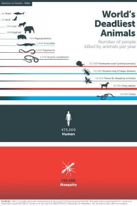 hat sharks, who get such bad press each year, are in reality very low on the scale of deadly killers. The top two killers are the mosquito followed by humans. The infographic was part of Mosquito Week, an campaign funded by the Bill and Melinda Gates Foundation to draw attention to their campaign to eradicate malaria.
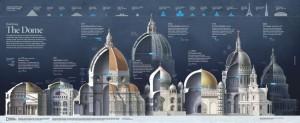
Some of the infographics are stretch out over three and four pages. The infographic on the Duomo in Florence is ten pages and visually stunning.
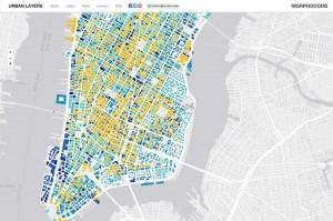
The last part of the book is a selection of the top ten interactive infographics. While these are again visually compelling it is best to look at them online to really experience how powerfully the information is displayed. The Urban Layers interactive map created by Morphocode explores the structure of Manhattan's urban fabric. The maps lets you travel through historical fragments of Manhattan that have been preserved and can still be found in the densely built city environment. Take time to explore the website. It's a fascinating tour from 1766 to present.
About the Author

Maeve previously worked at the Iowa City Public Library as the Adult Services Coordinator.